Monday, April 30, 2012

Chinese - My kind, not the real kind.


If you've been around a while, I need not explain to you that we have an affinity for Chinese food in my family.  Well, all of us except mr, which is funny since he has to travel there so frequently.  Although, he is the first to say that what he eats there really is nothing like the Chinese food we make...
Anyway.  I saw some sesame chicken pinned on pinterest and knew I'd have to make it for my mom's sake - it's one of her favorite dishes.  You can find the original recipe on blogchef.net here.  I didn't change a single thing from the recipe, so I won't repost it here.  I highly suggest you click over and take a look though.  It takes just a bit of work and is astonishingly similar to what you'd find in a restaurant - actually better, because the sauce seems lighter and not as syrupy.  Also, the same post at blogchef.net includes an entire Chinese buffet of recipes - not kidding.  9 more yummy sounding recipes that I'm going to have to go back and try.

I decided to make my baked crab rangoons as well.  I've made them many times in the past.  I originally got them from a magazine somewhere.  They are ridiculously easy to make.

Baked Crab Rangoons
1 package wonton wrappers (found in the produce section by the tofu)
1 (8 oz.) package cream cheese
1 package crab meat (real or imitation - your choice)
1 green onion, chopped
1/4 tsp garlic salt
1/4 tsp onion powder
Preheat your oven to 350.  Mix the cream cheese, crab meat, garlic salt and onion powder well with a mixer.  Place one wonton wrapper in each cup of a muffin tin.  Press them down into the cup and press the wrapper up onto the sides.  Spoon about 1 T of the crab meat mixture into each cup.  Sprinkle each rangoon with a few pieces of green onion.  Bake for 15 minutes or until the wonton wrappers are golden.  Best served warm.
Took the green onions off for my mom... but it's better with.
Now the cool thing is that this recipes works just as well for fried wontons - just close up the wrapper and put them in hot oil, right?  Right.  It's just not healthified that way.  I've gotten rave reviews of these rangoons in the past - just make sure NOT to use the canned crab meat.  I'm serious.  I've tried it.  Don't do it.  Uck.

Since I found the main course on Pinterest, I decided to go with a Pinterest dessert as well.  I chose these delicious-looking orange pushup smoothies from Averie Cooks.  In the post, she describes how she means to freeze these into actual popsicles.  I decided to put my push-up molds from Mindy Mae's Market and make actual dreamsicle push-ups - the popsicles of my childhood.  I will include the recipe, since it actually calls for a bit of variation depending on taste.  

Dreamsicle Push-Ups
1 can orange juice concentrate, slightly thawed
1 cup milk (half and half, cream, nut milk, soy milk)
4 scoops vanilla ice cream
1 cup sugar
1 teaspoon vanilla extract
1 cups ice, or to taste
Combine all ingredients, except ice, in a large blender and blend until smooth and creamy, taking care the sugar has dissolved and is well incorporated.  If desired, add a splash more milk.  Add the ice and blend until smooth.
That bit about making sure the sugar is dissolved?  Yeah, do that.  I didn't at first.  Luckily I tasted before pouring it into molds and blended it longer.
Turns out that if you want these to be actual popsicles you need to plan ahead (REALLY?!) and make them the day before.  Otherwise, you'll be eating them like this:
which is how the original recipe presented as well.  We ended up pouring our excess into little plastic cups like this:
The top is just card stock punched with a large scalloped punch with a slit cut in the middle for the popsicle stick.  These and the molds, when left in the freezer for another day froze well and we DID eat them like popsicles and they WERE scrumptious and DEFINITELY reminiscent of childhood.  We'll make these in the summer for sure.

This was definitely a yummy dinner.  And what better way to send your husband off on a two and a half week business trip to China (and Peru) than with Chinese food?  It's gonna be a long two weeks...


*Be sure to check the right sidebar for all the fun parties I link to!

Friday, April 27, 2012

In Conclusion - This Craft Was Crazy. (Did I mention that?)


If you've been following along this week, you've already made some personalized pushpins and created cheap, functional and cool alternative bulletin boards.  So what now?  We turn our average, ordinary chalk-cork boards into this:


This is, by far the most time intensive portion of the three-part tutorial, but the good news is that it's the last part!  Alright.  Let's go.


You'll need:
A projector of some kind (I used an opaque projector so this tutorial is specific to that.  If you use an overhead, you'll need some different things... like a transparency of a map... but I'll let you figure that out.)
A map of the world printed from the internet
A pen
BIG sheet of paper - or many sheets of paper.  Depends on how big they are.
Tape
A Pencil
Ruler/tape measure/straight edge
A Box Cutter
Glossy white acrylic craft paint
a small paintbrush
Patience
Patience
More Patience
Persistence
Determination
Stubbornness
Many episodes of Psyche, Arrested Development or The Office.  Pick your poison.


Are you ready?  Have you prepared yourself mentally?  Ok.  
Oh, hey, I have to warn you.  Yes, my camera was broken at the time I did this project.  Yes most of these photos are taken with my phone.  And yes, it was night when I did most of this, because I was SCRAMBLING to get it all done on time.  So the picture quality is less that desirable.  Sorry. 


1.  Find a world map online.  Simple enough that you don't get distracted and overwhelmed with details.
2.  Get your projector going.  As I said, mine was an opaque projector, so I just printed out the map from the internet on regular computer paper, stuck it in, adjusted the distance from the wall to get the size I wanted, and focused.  Bam.  Easy.
3.  Tape a bunch of paper up on your wall about the size you want your map to end up.
4.  Turn off the lights.  Look!  A map!
5.  Use a pen or fine point marker to trace around the continents and islands.  You can include as much or as little detail as you want.
6 (and 7).  The last two pictures are of the map all traced with pen.  I had to draw over the tape in some spots.

8.  Spread your traced map out on the floor somewhere.  I already mentioned that you'll ignore the gross garage, right?
9.  Lay out your chalk-cork boards on top of the map in the order you want it to be.  Make sure that the map is completely covered by boards.
10.  Measure each individual cork board inside the frame.  You want the actual dimensions of the chalk-cork board - minus frame.  Got it?  NO FRAME.  Ok.  It's a good idea to keep a little diagram of the layout of your boards; you can write the dimensions for each one right there.
11.  Now, use a yardstick or other straight edge and tape measure to measure and mark lines for every board.  Use the dimensions sans frame that you took in the previous step.  Draw the lines right over the continents.  This way you will be able to see where you'll need to leave out a little ocean, etc, in order to get everything to fit well.  And since you're not painting the map lines on your frames, you need to leave those out of your measurements.

12.  Now, cut your map to pieces on the lines you marked.  I know, this part is scary.  It DID take you an eternity to trace, after all.
13.  Set each piece of map inside the corresponding bulletin board.
14.  Take a sharpened pencil and trace along the map.  You'll want to press pretty firmly to make sure it's "transferred" onto the cork, and don't worry if your paper tears.  You won't need it after this step. For many of the bulletin boards, I was able to use a pencil to get a deep enough groove, although some required box cutters - see below.
15.  Lift the map off, and you should be able to see a faint groove from the pencil tracing.

16.  Do this for every map.  Some bulletin boards didn't react well to the pencil, so I traced with a box cutter instead.  I think it may have been more effective to do this step with an xacto knife instead.  I realized very quickly while trying to do northern Europe and Russia that no matter how messy this part was, I needed the help of Psyche.  And then Arrested Development.  So I hauled everything inside.  You'll be at this part for a while, people.

17.  Once all of the maps have been traced/transferred onto the cork board, it's time to paint your map.  Get out your white glossy acrylic craft paint and squeeze a bit onto a paint pallet of sorts - cardboard for me.  Using a small brush, just paint freehand over all of those grooves you just transferred.  ALL of the lines.  For EVERY continent.  and EVERY island.  And EVERY... uh... other map thing.  I thought Russia with all the bays and peninsulas and inlets would be the hardest... 


Until I got to Northern Canada and the islands near Greenland.  Stupid islands.  I left a couple out.  I figured, we're not going there anyway... it's not really on my bucket list.  If I want to freeze, I'll just stay in Wisconsin for the rest of my life.


You will likely have to do at least two coats of paint - I know, this is starting to sound like the perfect craft if you're a glutton for punishment, huh?  I just liked how much more bold the lines were with more coats of paint - most of my lines have three coats.  You can see I also outlined China and India - which mr thought was weird - but the whole landmass of Asia just seemed too huge to not be broken up into pieces, am I right?  I needed a visual reference for what separated the far east from Russia.  Is that weird?  Oh well.  Those lines are fainter, though, so you can see what the whole map would look like with only one coat.
 And if you, like my mom, are confused - those filled in white spots are lakes.  Any lake that was big enough to register on the world map made it to my map.


Combine this with a chalk-cork board for your personalized pushpins and you're ready to go!

Now, what is the purpose of being able to WRITE and ERASE on your map?  What is the purpose of doing this AND being able to put pins in?  WHY would you want to make this anyway??


You see, the pins can keep track of where you've been, where you are, and where you are going.  And writing on it?  Well, that can be helpful for keeping a color key for your pins (no, our names are not actually Jojobear and Koolbeans.  But this was supposed to be anonymous at first...), or playing guessing games with your family... Maybe you want to have the kids put pins in to mark their guesses for family history questions (In what state was Grandma born?) (See, it teaches proper grammar, too) OR Social Study questions (What country boasts the largest population in the world?) or other geographical questions about national capitols and such.You could also quiz your kids by having them write the continents or even countries names in the right spot.


OR, draw some geographical features (look!  Mountains!  A rainforest!) or write a little note about a trip that's coming up!  (Look where we're going in May!) (Yes, that IS an airplane...)


And the ensuing photo shoot forced me to gussy up our reading nook behind our couch.  That's a nice bonus.


*Be sure to check the right sidebar for all the fun parties I link to!

Wednesday, April 25, 2012

Part Two of This Super Crazy Craft (it's a working title)


The minute my brain envisioned the Cork/Chalk Board Map Gallery Wall, I knew I HAD to make it - no matter what.
The thrifty side of me contested.  "But bulletin boards are so expensiiiiiiiive...." (whiny voice.)
The awesome side of me insisted.  "Does that really matter?  I think not!" (take charge voice.)
But really, the awesome side of me HAD to compromise with the thrifty side of me.  Mostly because of my husband's stipulations on my craft budget.  (booo!)
I already had two bulletin boards that were really put to good use - hahaha! Oh, man, I couldn't even keep a straight face TYPING that! - sitting around waiting for me to use them for the preschoolers preschooling.  And since that wasn't happening (using the board, I mean... I kind of TRY to teach my kids...) I knew I had two right there.
So, I put my thinking cap on.  I imagined up a map of the world.  I figured I needed at least two more kind of big bulletin boards for a total of four decent sized ones (you know, the four main continents...) and then three or four smaller ones to fill in the gaps.  The thrifty side of me laughed at the awesome side of me, knowing that even bulletin boards at Walmart at that size are at least 15 bucks and that's not taking into account all of the other materials I needed.  But the awesome side of me wasn't taking any of that crap.  This wall was meant to be, it shouted!
I went to buy some spray paint from Michael's - the chalkboard kind.  I thought that was the easiest way to go.  While I was there I came across this sale on big pieces of foam board.  I don't remember exactly what the sale was - it was like a 3fer sale and I wish I'd gotten like 600 because you can never have too much of this stuff right?  Anyway, I saw that sale and my awesome side totally put my thrifty side in its place.  It was all, "Ha!  I knew there was a way!"
So, enough of the back story.  You just want to know how to make your own bulletin board for cheaper than the $20 you'll pay at the store for a nice one, don't you?  The cool thing is (aside from the cheaper thing), all of these bulletin boards will be different, which totally adds to the awesome gallery wall feel.

You'll need:
Bad thrift store art in a decent size - really whatever size you need.  Mine were around 13x17 and 18x14.  Make sure the frames look cool.
Spray paint in your choice of color - I used Krylon "Banner Red" and Rustoleum "Lagoon".
Cork tiles
Sheet of cork
foam board
box cutter
spray adhesive
gorilla glue or other heavy duty adhesive
Chalkboard paint - spray or brush on, I actually ended up preferring the brush on.
Painter's tape
something to decorate a blank frame with (like little scrap pieces of wood).

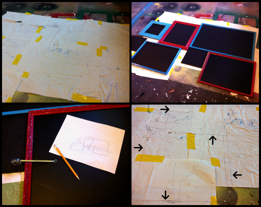
First - lay out your cork.  If you are using some pre-made bulletin boards, lay them out, along with your sheet of cork and cork tiles.  Everything cork-y should be laying out.
(You will please excuse the disgusting state of my garage.  I am lucky to have a husband who doesn't mind crazy spray paint spots all over the place.)
After you lay it all out, you'll start with your chalkboard paint.  I did two coats of spray and 3 coats of brush on.  
A note about chalkboard paint:  I thought the spray would be easier, but I was wrong.  First, although it looked black in the picture on the can, it was green, which was totally WRONG. I used it anyway, because I figured the more coats of chalkboard paint the better and I knew I didn't have enough brush on stuff left to do a ton of coats.  After the spray paint dried, I went back and brushed on (rolled on in some cases) the black chalkboard paint.  The coverage was MUCH better.  It went on smooth.  It didn't soak into the cork as much.  In short, I preferred the roll on kind.
At the same time, you'll want to dismantle your bad thrift store artwork.  You can do whatever you want with the art - bonfire, let your kids scribble, make it into a scooter ramp, whatever.  It's just the cool frames we want.  Lay the frames out and spray them with the spray paint in your choice of color.  You'll want to let them dry between coats.  I gave my frames 4 or 5 coats, to really get into all the grooves.  

NOW.  This is when I tell you that this tutorial within a three-part tutorial is actually a three-part tutorial in itself.  I told you this was an insane craft.  I'm going to show you three ways to make yourself a chalk/cork board.

1.
Once everything is dry, we'll get out the foam board.  Lay your bad thrift store art's frame face down.  Place a piece of foam board in the frame, matching up one corner.
Mark where the frame ends on the other corners.  If you're ghetto smart like me, you won't even bother looking around for a pencil, you'll just mark it with the box cutter.
Then, use the box cutter to cut the foam board to the size of the frame.

Now, lay your foam board pieces on top of your sheet of cork.  Cut roughly around the foam board - it doesn't have to be perfect. 
(You will please excuse the state of the foam board on the right.  It had an accident.)
Flip the pieces of cork over and spray the back down with spray adhesive.  Wait a bit to make it tacky.
Place the foam board on the cork.  Press firmly down all over.
See how the cork kind of hangs over the edge of the foam board?  Trim it down.

Now, all you have to do is pop the chalkboard-paint-covered-cork-covered foam board into your thrift store frames - which you have already spray painted to a beautiful shade.  Secure the foam board into place either a) with the hardware stuff on the back of the frame or, b) with staples if all of the hardware suddenly goes missing as mine did.

2.
Get your chalkboard-paint-covered cork tile and lay it on your foam board.  Trace around it (since you've finally found the pencil...)
Using a ruler, draw a larger square around the one you traced.  Cut the squares out with your box cutter.
Pop out the middle square and clean up any rough spots.


Place your cork tile in the middle of the foam board frame.  It should fit tightly enough that you do not need anything to hold it in place, but if you DO need something, you can glue strips from the foam board over the back.
I used an old jenga game I got at the thrift store to make the frame.  I like that the wood tiles were used-looking.  Start in the corner of your foam board and use your Gorilla Glue to glue down one or two tiles.  Then glue another along the other edge, going perpendicular to what you just set down.  The pieces should be movable for a bit, so you have some time to make sure that they are overlapping the edges of the foam board evenly.
Continue gluing down pieces, putting glue on the bottom and sides of the pieces and fitting them snugly together.
When you're almost done, you'll probably run out of jenga pieces, so you'll have to raid the family jenga game for about 6 tiles or so.  It's alright.  It's not like anyone plays it anyway... that's why it was at the thrift store...

Then all you have to do is spray paint it - your choice.  "Lagoon" in my case.  Make sure you tape paper over the chalkboard part before you spray paint the frame.

3.
If you've got some pre-made bulletin boards, this is, of course, the easiest route.  After painting the cork with chalkboard paint and letting it dry, cover it with paper and use painter's tape to seal the edges.  Then spray the frames.  Voila!  Beautiful!
When you peel up the painter's tape from the bulletin board, you will likely have a few spots of chalkboard paint come up with the tape.  Just use a small paintbrush to do some touch ups.

So, let's do a quick breakdown, shall we?  We need four large bulletin boards and four small bulletin boards for our gallery wall.  That would be about $100 just in bulletin boards.  The whole project could run about $150 or so!  Even the awesome side of me balks at that.
BUT!
2 large bulletin boards - FREE (one I got a long time ago and the other I found on the curb)
2 bad arts - $2 each, so $4
4 pack of cork tiles - FREE (found in my mom's stash - thanks mom!)
2 cans of spray paint - $3 ish (the red I had already - I just bought the turquoise)
1 long sheet of cork - $8.20 ($12, but 40% off coupon)
foam board - 3 for something, I think it was $2 and something and I got 6 so we'll just say $6
1 Chalkboard Spray paint - about $3, but you could totally do without this.
Chalkboard paint, spray adhesive, painter's tape, Gorilla Glue, Jenga game pieces were all on hand - so FREE!

Total, I got about 150 dollars of project for around $24.20 ish.
AND they look awesome.

This pleases both my thrifty side AND my awesome side.  That's the best kind of project.


*Be sure to check the right sidebar for all the fun parties I link to!

Tuesday, April 24, 2012

Part one of what I call The MOST INSANE CRAFT I've Ever Undertaken.


Remember when I auditioned for you SYTYC?  (No, NOT THAT TIME.)  And I came up with this:


And then I promised you a tutorial for it?  And that was about, uh, forever ago?  Well, when I promise, I deliver.  It might be after you've all forgotten about it, but I deliver.


The tutorial is actually three separate parts - the making of the bulletin boards (they're not real bulletin boards - but they're just as good, only cheaper!), the making of the map gallery, and the making of the personalized pushpins.  Why am I talking like some documentary?
Anyway, I've divided the how-to's into three tutorials, so it won't be so incredibly long and crazy to read through.


First up: Personalized Pushpins.


For the record, that's not really sculpy, it's Fimo.  I think I like Fimo better... more colors to choose from and it seemed a little easier to work with - AND it's cheaper!  But that's totally personal preference.


Cut a little triangle piece out of card stock for your pattern.  I wanted my pushpins to look like little flags.  Take a piece of fimo and spread it out to the height of the triangle pattern and really long.

Take your pushpin and set it in the middle of your fimo.  
Fold one side over the pushpin.
Gently smoosh the sides together and start shaping the clay so that it's straight and angular instead of rounded.
Lay what will be the short side of the triangle down on the work surface and push gently to make it nice and flat.

Lay your triangle pattern on your clay piece, over where your pushipin is.
Use a sharp knife to cut around the pattern piece.
Pull the extra fimo away and take off the pattern.  Gently shape any edges if needed.

Use your letter stamps to mark an initial.  
Place the stamp over the clay where you want your letter to appear and gently press down.
Turn your flag over and mark the initial on the back side, too.  Reshape any edges if necessary.

Line your baking sheet with wax paper.
Lay your triangles on the wax paper.

I used one color for mr, one color for me and one color for both of us.  These flags represent the places we've gone individually or - for the red ones - together (for this one, I used our last initial).  The small white balls have stars stamped on them.  These represent the places we want to go.  There is also a small ball in each of our individual colors - blue for where mr was born, yellow for where I was born, and red for where we currently live.

Follow the directions on your particular clay for baking your pushpins.  Once they are baked completely, let them cool.  Pull them off the wax paper and you've got cute, personalized pushpins for your awesome Chalk-Cork Board Map Gallery Wall.  What a mouthful!


Up next: How to make your own bulletin boards on the cheap!


*Be sure to check the right sidebar for all the fun parties I link to!

Monday, April 23, 2012

Well, at least the dessert was tasty.


Well, I admit it.  This isn't my most exciting dinner ever, but I was looking for something easy.  And it had to involve rice.  Why?  Because I happen to have a lot of rice right now.  This meal fit the bill to a T.
I found this recipe on Taste of Home.  I made some slight alterations which are in the recipe below.
Santa Fe Chicken

1 large onion, chopped
1 T olive oil
1 garlic clove, minced
1-1/4 C chicken broth
1 can (10 oz) diced tomatoes and green chilies, undrained
2 T lime juice
1 C uncooked long grain rice
4 boneless skinless chicken breast halves (4 ounces each)
1/2 tsp salt
1/4 tsp pepper
1/4 tsp ground cumin
3/4 C shredded cheese (Cheddar or Mozzarella)
fresh cilantro
In a large skillet, saute onion and jalapeno in oil until tender. Add garlic; cook 1 minute longer. Stir in broth, tomatoes and lime juice; bring to a boil. Stir in rice.  Sprinkle chicken with salt, pepper and cumin; place over rice mixture. Cover and simmer for 10-15 minutes on each side or until a meat thermometer reads 170°.  Remove from the heat. Sprinkle with cheese; cover and let stand for 5 minutes. Garnish with cilantro and/or limes.


I confess that this wasn't my favorite dinner ever.  It seemed a little bland - I probably could have added a bit more lime and probably some Cayenne pepper.  My hubby and dad liked it though.  (My mom was sick and wasn't here...) I think I'd probably make it again, even though it wasn't the best meal ever, because it was so easy to make and only used one pan.


I decided to compliment this with my "world famous" Brazilian Lemonade (which is actually limeade, so why do they call it lemonade?).  This picture doesn't do it justice.  You can find a much more appetizing photo of Brazilian Lemonade here, with a downloadable recipe card.


For dessert, I made Easy Cheesecake Bars - specifically the ones found here on allrecipes.  Going with the easy theme again, I was searching for something uncomplicated and quick.  It wasn't the easiest dessert you can make (that would probably be Peanut Butter Fluff Pudding Dessert or the Pudding Torte) But aside from the chilling time, it was pretty quick.


Easy Cheesecake Bars
1/3 cup butter, softened
1/3 cup packed brown sugar
1/3 cup chopped walnuts
1 cup sifted all-purpose flour
1/4 cup white sugar
8 ounces cream cheese
1 tablespoon lemon juice
2 tablespoons milk
1 egg
1/2 teaspoon vanilla extract
Preheat oven to 350 degrees F(175 degrees C).  
To make Pastry: Cream together the butter and brown sugar until light and fluffy. Add in the flour and chopped nuts and stir until mixture becomes crumbly. Press pastry mixture into 8-inch square pan and bake for 12 to 15 minutes. Let cool on rack.  
To make Filling: Beat together the white sugar, and cream cheese until smooth. Stir in the egg, milk, lemon juice, and vanilla and mix well. Spread filling mixture over baked crust. 
Bake for 25 to 30 minutes. Let cool on wire rack and refrigerate. Optional: serve with fruit. 


Not sure if I did something wrong - but the pastry part was kind of dry.  I think I'll look for a different recipe when I do cheesecake bars again.  
Or maybe I'll just stick to these Key Lime Cheesecake Bars.  So tasty!


All in all, not the best dinner ever, but not the worst dinner, either.  Sometimes you need easy and mediocre right?  It helps you appreciate the other alternatives!


*Be sure to check the right sidebar for all the fun parties I link to!

Thursday, April 19, 2012

Hey, Hey, Hey... Goodbye! (part deux)


Ready for the continuation of our photo editing software hunt?  If you'll remember, we have a list of needs/wants, and a list of software to try:

needs:
CHEAP (or even better, free!)
Basic edits - exposure, contrast, color correction, saturation, sharpen, resize, crop and rotate
Advanced edits - clone
Touch-ups - wrinkle remover (I need that one for any photo of myself...), red eye reduction, blemish correction, eye color, eye brighten, blush, teeth whiten
Other Effects - Cross Process, Black and White, Sepia
Extras: Graphics, Frames, Borders

wants:
Basic Edits: Clarify
Advanced Edits: Curves
Touch-ups: Airbrush, Mascara, Tan, Skinnify
Other Effects: HDR, Antique, Texturize, Fancy Focus
Extras: Collage

The photo editing sites I looked into are:
lunapic
ipiccy
Phoenix (from aviary.com)
And yes, even though I'm morally opposed, I DID get a google+ account just to try out Creative Kit.


Yesterday, we went over the first three.  Today we'll finish up our list of software options.  Hopefully you'll see one that appeals to you!


Phoenix (aviary's photo editing software)
Basic info:  It's free. You do need to create an account though.  There isn't a "premium" membership option.
                     Pros - no hassle, no fees, access to all editing tools
                     Cons - pictures aren’t saved to the software and there is no “history”; you can’t                  
                                  upload multiple photos at once
Phoenix is similar to ipiccy in that you need to enable local storage if you want to save your creations.  The photos save to the software online and you are given specific URLs for the image.  You can publish your photos to "aviary" to "make them discoverable" - which seems a lot like photobucket or flickr, but it doesn't seem as easy to set up (albums? categories? galleries?  I don't know...)
Perks:
Can upload your own custom filters
A lot of Photoshop-esque tools 
Layering abilities
Downers:
Takes a LOOOONG time to upload or save a photo - a veeeeeeerrrrrrrrryyyyyyy loooooooonggggggg time.
Can only upload and edit one photo at a time
Learning curve - it's NOT like picnik
No "readymade stickers" to add
limited special effects and filters
Arg.  Dumb watermark.
No collage!
Other Impressions:
There are definitely not as many filter or color options - but you can upload your own.  I suppose if you know how to create your own "actions" this would be helpful.  There are some special editing tools - it seems a little like photoshop.  For instance, there's the option to cut a selection of the photo with a shape or freeform and then move it somewhere else.  Other non-picnik-like tools include Magic Wand, Smudge and Liquify.  I really had no idea how to use most of them, and sadly there aren't any tutorials right on the software, so you’d have to either a) already be familiar with similar editing tools or b) google it if you're like me.  Even the tools I DID recognize and the basic editing options didn't seem intuitive while tweaking my photo - so it's a lot different than picnik and not nearly as user-friendly.  I also didn't really like the filter options they did have.  The one exception was emboss which makes your photo look like it's printed on heavyweight paper.  There are no sliders for the filters so you can't tweak the effects - if you use a color effect and don't like it, there's no way to adjust it.  It doesn’t show you a preview before you do the edits, so if you apply them and then don’t like it - even if you just added a TINY BIT too much blue or something - you have to wait for it to apply and then wait for it to undo.  It would definitely take some time to figure out completely... I'm sure it must have similar capabilities to picnik, but the tools I use regularly (like clone) just weren't apparent to me.  There is the option to add text, and the really cool part is that you can use any fonts downloaded to your computer.  You can do layers, just as in photoshop.  I could pick many of the other photo editors up within a few minutes, but this would take hours PLUS research for tutorials to figure out how to do all the things I liked doing on picnik - like clone and adding filters such as antique or cross process.   All in all, it seems you’d have to spend a lot more time with this to be comfortable.  Plus it seems like the capabilities are tailored for different needs/wants. 
Example:
Overall Rating: 
1 and 1/2 out of 5 stars - I just don't think it's worth the time and effort to figure it all out.  There aren't nearly enough readymade filters.


Basic info:  You have to set up an account to use it but it's free.  There is a "Pro" version that gives you more bandwidth for saving your photos.  You can connect to Photobucket and use all your photos from your albums there.  It seems to have the capabilities to set up albums in FotoFlexer as well, but I couldn't figure it out just by playing with it.
Perks:
Collage!
Downers:
Takes a long time to upload.
Can't upload multiple photos at once.
Other Impressions:
If you have worked with photobucket, FotoFlexer will look really familiar to you.  
Some specifics?  The collage has only simple templates in grid form - rows, columns or both - and you can have up to 25 photos.  You can adjust the spacing between and the proportions.  You can change the background color or make it transparent.  You upload the pictures directly into the space you want them to be in, instead of dragging and dropping.  Dragging and dropping seems a better way to see the whole project while you are working on it and change things more easily.  There are a lot of artistic effects (pop art, pixelate, cartoon, oil painting, sketch, etc.)  My favorites were Old Photo and (of course) Cross Process.  It is possible to add layers with other photos - you just upload a photo over an existing photo - as you would have dragged and dropped from the photobasket in picnik.  The main difference is that you have to wait for it to upload separately and you can’t see all of your options beneath the photo you’re working on.  The erase tool seems handy in conjunction with this layering feature.  It seems like something that would not be intuitive to picnik users, but perhaps to photoshop users?  When you make layers and upload images or create your own graphics with stickers you can group items together (like the merge tool in ipiccy).  This is something I always wished picnik could do.  You can cut out pieces of your photo and layer just those pieces separately from the original picture, or get rid of the original picture all together and just keep the cut out.  This could be useful in creating posters or invitations.  There seem to be a lot more capabilities than I was first aware of and I would need to play with it more to come to a complete decision.  My opinion now, though I’m more impressed than my initial impression, is that it just isn’t quite right.  There aren’t any color filters or processes.  The touch up tools are limited.  It’s missing too many of the things I loved about picnik.  For some projects it would work perfectly, but for straight editing and making something beautiful, I don’t think it’s quite up to par.
Overall Rating:
3 out of 5 stars - Pretty good capabilities, but not quite what I'm looking for.


be funky

Basic info:  You need to create an account.  You can use the free version or the "premium". The premium version comes with more editing tools - just like picnik.  You can use all the tools for a limited time when you sign up. 
Perks:
Similar to picnik in ease and aesthetic.
Downers:
Can only upload one photo at a time.
No premade basic shape stickers - just fun ones, holiday ones and speech bubbles
Other Impressions:
be funky is definitely user-friendly.  For a lot of the filter effects and artsy effects you can see a little preview of the overall idea of the effect before you even apply it, so it’s nice to know what they do if you aren’t familiar with the titles.  Also, there is a history button at the bottom so once you apply an effect and don’t want it anymore you can click on history and go back to the original.  They have most of the same effects and filters that picnik had, and a few I hadn't used.  Some that I really liked were the “enhance detail” function and the Fisheye Effect.  The “united colors” effect was fun - a lot like a toned down popart.  One of the coolest effects available is the tilt shift tool - it looks really professional and is fully customizable - size, amount of blur, angle - you can do horizontal or circular.  Love that.  The only thing I'm not crazy about with that is that you can't place it anywhere you want in the photo - it's always exactly in the middle.  There are four different vintage effects(!) and their viewfinder effects are really cool, too (there are 12 of those)!  There are a decent amount of font options, not quite as many as picnik.   If it had clone, collage and basic shape stickers to add it would be pretty near perfect.  Darn it. 
Examples:
One of their FOUR different vintage colors options.

One of the viewfinder options I mentioned above.  You can fade it and make it as strong as you want.

Pinhole option with the "fisheye" effect.  I think the fisheye effect is pretty fun.

An example of using their tilt-shift creator.

One of their "artsy" options.  There are two different "impressionist" effects.  Really fun.

Straightforward edit using: crop "golden ratio", enhance details, adjust the exposure, add matte.

Overall Rating: 
 3 and 1/2 out of 5 stars - Really fun effects, easy to use.  But there are some downsides - no collage, can't upload multiple photos, very few shape stickers...


picmonkey

Basic info:  Just launched March 9th.  Many are hopeful that this will be a picnik substitute - very similar in options and cost - because guess what?  It’s created by ex-picnickers.  Right now you can sign up for the premium options for free for a few months and at the end of the trial they’ll email a coupon for you to continue using premium for a small cost.  You do create an account. 
Perks:
Free/small fee
a lot like picnik, so there's not much to learn
clone!
Downers:
Can only upload one photo at a time - no storage on the software
no collage - yet
Other Impressions:
 picmonkey has said that they are aiming to be just as user-friendly “or better” than picnik.  (see their new FB page - picmonkey on facebook - for more details.)  You can also leave them feedback on FB - they say “We're tracking every single feature request. We're planning on launching with most of the favorites, we've got some new tricks up our sleeves, and the rest will surely follow.” So if you want something, might as well try it! 
I noticed they have many of the exact same features/tools/effects as picnic with the same result.  (Obviously the interface is different, with the available edits down the left side instead of across the top, but even the controls sliders are the same).  They have all of my “required” items and most of my “would like” items EXCEPT for collage.  Since I first looked into picmonkey, I noticed that they've made some updates to it.  They have added more filters - both with color and camera type.  I played around with some of them and loved the results.  From my rudimentary understanding of Photoshop, I gather that these filters give you results similar to adding "actions" that have been pre-created for you.  All I can say is that I love the ease of using these filters.  I also noticed that they've added an entire "textures" section, which they did NOT have at all the first time I was there.  I haven't played with these yet, but they look very cool.  There are TONS to choose from - way more textures than were available on picnik.
They also have stickers (which they call overlays) and many available are duplicates of what you find on picnik - though there are not as many.  There also aren’t as many fonts to choose from, but some of them are pretty cool.  You add and edit  them in the same way as picnik.The most major difference I noticed was that there was no “history” of saved projects and photos. 
I know there will be continued updates in the coming weeks - they have promised collage soon.   Their catchphrase?  “This is your photo on awesome juice”... We shall see.
Examples: (sorry, there are a lot)
picmonkey's version of HDR.  Pretty straightforward - nice results.

picmonkey's Warhol effect

A basic example using clarify, exposure adjust and adding text.

Edits unique to picmonkey:

Using "Burst" (kind of like vibrance)

"Daguerrotype" - LOVE this "camera" filter

"filmstock" - another "camera" filter.  Love the definition and coloring.  This particular effect has multiple options for the look.

"Intrepid" - one of their cool color filters.  You can fade it as much as you want.

"Time Machine" - another color filter.  There are a few different options within this effect.

"Tranquil" - it might be my new favorite color filter.  It's a toss up between this and cross process.

"urbane" - another color filter.  
Overall Rating: 
4 out of 5 stars - I'm hopeful this will be a good fit - once they do some more upgrades.  


Creative Kit
Basic info:  It's free, but you have to have a Google+ account in order to use it.  I don't get Google+ at all.  (Who are these people writing to me?  Why don't I know them?  That's beside the point.)  You basically upload your photos into albums as you would on FB, then click on the individual pictures and click on "creative kit" in order to edit them one at a time. It's really just a cross between facebook and picnik.
Perks:
Looks EXACTLY like picnik.  No learning curve here!
Many of the filters and effects you already love
Some extra filters that are really cool
Downers:
No clone!
No collage
Fewer graphics and "readymade stickers"
Other Impressions:
This seriously looks EXACTLY like picnik (obviously) with a few exceptions.  Almost everything is even in the same place under the same categories (almost).  All the basic edits of picnik are there.  Also, many of the same filters you love - lomo, orton, HDR, cross process, holga, cinema scope, 1960’s, tint, vibrance.  Also, there are some extra filters that I REALLY liked: daguerreotype, green fade, magenta fade, reala 400, Poloroid Plus, Sun Aged.   BUT, this really doesn’t make up for not having clone, focal zoom, and fancy focus.  There are some graphics (stickers) but not nearly as many as picnik.  There aren’t any basic shapes, which I think is odd.  There are stickers for special occasions and speech bubbles but that’s about it.  No texture and no layering abilities (on picnik you could add layers and combine photos by dragging a photo from the photobasket onto the photo that was already opened and fading it or using a special combination - like addition, lighten, darken, subtract, normal, multiply, etc.  Nothing like that here).  There are almost NO touch up tools - they have airbrush, shine remover, blemish fix, and sunless tan.  A lot of the ones I used regularly aren’t there - no blush, no teeth whiten, no skinnify, no wrinkle remover, no mascara, etc, etc.  They do have the same font options as picnik and the same mode of adding/editing the fonts.
No frames.  No collage.  I’ve heard that they will be migrating the majority of picnik functions to Creative Kit, but so far it seems lacking.  Plus, you know, I'm taking a stand and all.
Overall Rating: 


1/2 star - Well, maybe this rating isn't entirely fair.


The biggest thing I noticed across the board is that there is a lack of ability to store your photos on the editing software.  You generally don’t create an account in most cases, and if you do, it’s not immediately apparent where your photos go when uploaded.  Most that I looked at only allow you to upload one photo at a time to work on.  That’s kind of a bummer because I liked the flexibility of picnik to see my history and look at all the options of photos I had for a particular project I was working on all at once - especially when I was doing collages.  That’s another thing.  There’s a significant lack of collages (or USEFUL collages - pizap doesn’t count) - except with fotoflexer/photobucket and ipiccy.  


So who wins out?


I believe I'll be using ipiccy for the time being - but I will definitely keep my eye on picmonkey to see what future updates bring.  


How about you?

PS.  Think it might be time for us to take another family photo?  Zoe's only walking and talking now...


*Be sure to check the right sidebar for all the fun parties I link to!
Related Posts Plugin for WordPress, Blogger...